Google Analytics

Showing posts with label Renovation. Show all posts

1.16.2011

A Couple of Projects plus Outdoor Fabrics

My head has been swimming with ideas on what to write about next...outdoor inspiration pictures, decorating with plants, wainscoting and paneling, highlighting a great new artist I just discovered, or showing you who helps me out behind the scenes...the list keeps going.  Just wish there was more time in a day!  Well, one of my New Years resolutions was to complete some projects around the house and it looks like a couple of these projects are officially underway and I couldn't wait to share.

Project #1 - Dining Room Drapery Treatment

I recently designed a treatment for my dining room window and selected a fabric for the valance and panels.  I was torn for a bit on whether to install a shade under the valance or select a second fabric for a second set of panels that would traverse to the center.   Both the shade and the panels would provide some privacy or at least give the impression of privacy from inside the house.  I finally decided on the panels because I like the idea of using more layers and fabric in a room that currently has a lot of hard surfaces.  I think shades have a bit more of a casual feel and decided I wanted a more elegant look.  It was not the cheapest option but a solution that we will enjoy for many years to come.

I chose this Schumacher linen fabric for the valance and stationary panels.  It will bring in color and pattern to the room plus a touch of my favorite color...blue.

Kelmscott Manor Print Schumacher Fabric

The traversing panels will be a super sheer linen by Pindler.  Once pleated it will provide a little privacy but I didn't want the fabric to be solid so it wouldn't make the space seem smaller when closed.


I think the fabric goes well with my furniture and chandelier.


Here's the window the drapery will go on.  You can see the window has lots of horizontal and vertical lines so the last thing I wanted to do was add another piece of hardware above the window adding another vertical line.  Instead I'll have a inverted box pleat valance that starts at the top of the ceiling and covers the top moulding of the window.  This should help make the ceiling look a bit taller too.


It should be installed in 4-5 weeks.  

Project #2 - Outdoor pillows

I have not been enjoying Maryland's cold weather at all!  So it's been fun to think about warmer weather things such as designing cushions for my outdoor furniture.    Over the summer we stained our house green.  We used Cabot stain that was custom colored to look like "Urban Nature" by Benjamin Moore.   The window trim was painted in an off white color to match the new windows we had installed.


We bought our Brown Jordan outdoor furniture (table, chairs and the glider below) 8 years ago and it looks as good today as it did then.


So I picked 2 outdoor fabrics that look nice with our house color, outdoor furniture, and go with the look and feel of our home.  I really like them both but they have a completely different look.  This one is by Fabricut.  It's preppy with a seaside feel.   It coordinates well with the colors inside my house maybe even a little too well.  It's definitely the safer option of the two.


This fabric is by Robert Allen with a funky fun pattern with my favorite two colors.


Decisions, decisions.   

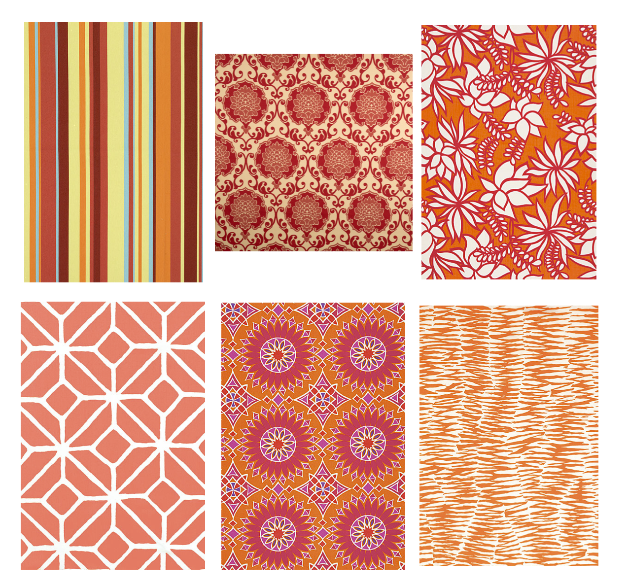
Now is a great time to think about your outside space!  If you get started now it will be done in time to enjoy it on that first beautiful spring day.   Below are some great outdoor fabrics I discovered while looking for mine.  If you click on the images below you can get a much better look at the fabric.  Enjoy!


 Please contact me if you would like help making your home beautiful!  Also, I'll be running specials on outdoor furniture so it's a good time to start thinking about it.


12.13.2010

My Bathroom Renovation

If you're thinking about doing a bathroom renovation soon...read this post!  We recently completed a bathroom renovation and we learned a lot in the process.  Just to give you a little background on the project, Reid and I hired an architecht last fall to help us with renovating our home.  We knew for sure we wanted to replace windows but wanted to ensure we weren't wasting money on new windows in parts of the house we may change later.  So we gave him our entire wish list and before we knew it the project took on a life of its own.  So after three months of design meetings we received gorgeous plans of our dream house.  Then we learned it was going to cost much more then we were willing to spend.  So we decided to stage the renovation in three parts.  The first part was completed this past summer which included all new windows (requiring several walls to be rebuilt), a front portico and door, replacement of a decaying second story deck, opening up our living room and sunroom to make one big room, interior and exterior paint and a redo of our master bathroom.  Our master bathroom will hopefully become a guest bathroom (in stage 3) so I tried hard to keep this in mind.  This bathroom was a fun little project that I really enjoyed working on.

Unfortunately, I don't have before pictures to share.  You'll have to trust me that it was bad.  It had yellowish toilet, sink, vanity and bathtub surround.  A 30 year old tile floor that was losing tiles weekly.  A fan that didn't work so mold was always growing.  The bathroom is small at 5 x 8 feet and we had no plans to enlarge it.  So I wanted the bathroom to be light, airy and spa like.

Below is the design process I went through.

First, I searched for inspiration pictures that I referred to during the design process.  This bathroom is so peaceful, pretty and unfussy.  Things I love about it are the big windows that let in lots of natural light, the beautiful artwork, the clean lines of the tub, plumbing fixtures, and shower glass.  The architectural details and accessories keep it from being too bland!


This bathroom also uses a monochromatic color scheme but it is not boring because of the different materials used such as the small 1x1 glass tiles on the knee wall, the 12x12 tiles on the floor, 8x8 tiles in the shower, the stones around the tub, and the weathered wood vanity.


Even though many spa like bathrooms do not have soft window treatments, I prefer them in the bathroom.  There are so many hard surfaces in a bathroom that I feel they need to be offset with the softness of fabric as the roman shade does in the bathroom below.


Then I set out to complete a design plan that included all the elements I wanted for the bathroom.  No walls were moving but I was removing the tub to make a nice size shower.  Below is the design plan I put together.  I like seeing all the elements together so you can ensure they all compliment each other plus it helps you visualize the final result.  The starting point was the fun striped fabric from one of my favorite sources. 


Below are the pictures of my finished bathroom.  Some of the pictures came out a little more "golden" then the actual color (my camera skills need some work!).

Below you'll notice a vessel sink, the wall mounted faucet (keeping a small vanity top free of clutter), and a decorative mirror that is covering a built in medicine cabinet.  You can see the window treatment in the mirror.  The background color of the fabric is a soft white.  I did not want white white fixtures which would have made the bathroom feel too cold.  Instead I used the bisque color for the sink and toilet which is much softer and warmer feeling.


I used a fossilized limestone material on the vanity, shower sill and shower niche.  I supposedly have to be careful not to spill red wine on the top because its porous but honestly I think a little comet on a honed surface will take care of any stain.  The fossils of shells were just too cool to pass up!  I also went with a simple shaker style cabinet door style.  I wanted a clean look that complimented the more contemporary plumbing fixtures.


A towel bar was put on the side of vanity so it wouldn't take up any valuable wall space.


I went with a toilet with a skinny dual flush bowl (14 inches wide).  Takes up less visual space in a very small bathroom plus it's eco friendly.  I did consider a wall hung toilet (very European!) to take up even less visual space but it was too costly to install.  The dual flush bowl works great and would highly recommend it.  Soft close toilet seats are great too.  No more slamming sounds when the seat is dropped down.


I found the artwork above the toilet in a gallery 10 years ago while visiting Niagra-on-the-Lake, Canada (a beautiful town if you're up that way).  I thought they worked with the look and feel of the bathroom.  I placed them above the toilet instead of a towel bar so I could see artwork when I walked into the bathroom instead of a bath towel.

Below is a flat roman shade for the new window which is slightly larger than the old one to let in more natural light.  Honestly, the shade is more for decoration then for privacy.  The window is hung high enough and I'm short enough that I won't be flashing the neighbors!  

I also had a pocket door installed (sorry no picture).  Before the door opened into the bathroom making it feel even smaller.  Now I can leave the door open and make the bathroom feel even larger.


The bathroom rug adds some soft texture.  I hung a 3 way hook on the wall for my towel, bathrobe, and PJs.  I also used the floor tiles for the baseboard moulding.  If the budget would have allowed, I would have wanted a frameless glass shower door.  Instead I opted for the much cheaper semi frameless door.  They sell these at the big home improvement centers but instead I used a local bathroom and kitchen supply center for mine.  I was able to upgrade the glass thickness and get one without a towel bar (didn't want to hang a towel on the door and block the view of the tile).  These options did not cost much more money and I think greatly enhanced the shower.  


I also had a teak seat installed that folds up and down.  It supposedly holds up to 300 lbs!  In reality I use it more as a foot rest when I'm shaving my legs instead of a seat.  


I wanted a tile that looked like a natural marble.  The natural marble doesn't cost any more than this tile per sq ft but it was much costlier to install...maybe for my next bathroom redo.   On the shower floor is a natural stone tile that feels great on the feet.  


Here's a close up of the tile design.  A mix of 12x12, 2x2, and 8x8 tiles (cut on the diagonal) accented with 2x2 blue glass tiles were used for the shower walls.  No fancy shower sprays here.  Again, this will hopefully become a guest bath one day so we cut out many of the luxury items.  The shower head works great.  My shower is now the "dog shower" because she can now walk into it easily and the removable nozzle makes it easy to rinse her off.  Good thing I love her!


I hope you enjoyed the pictures and information.  If you are considering a bathroom renovation and would like some guidance, please don't hesitate to contact me about my design services.

Thanks,


9.10.2010

Mantels

With Fall around the corner, I'm starting to think about building our first fire.  Honestly, it's not because I'm looking forward to the change in season but more to do with the fact that we just had our fireplace completely redone and I can't wait to use it.  I've also been giving a lot of thought on how to accessorize the mantel.  BHG, recently published an article on the different approaches you can take.  Below is the before and after pics of our fireplace followed by the 6 different ways you can accessorize your own fireplace.

Hope you find some inspiration and don't forget check out the Tips for Accessorizing a Mantel at the end of the post.   PLEASE send me (melissa@melissamclayinteriors.com) pictures of your fireplace to either post or get my two cents on!!


After redo


I'm sure I'll change the mantel accessories many times but for now I'm liking the clean simple look.  JC, the stone mason did a great job, especially considering I picked hearth stones that weren't all the same height.

Here is the BEFORE picture...


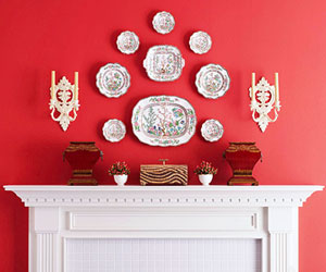
1.  SYMMETRY - a mirror image arrangement of parts or elements.  This is one of my favorite looks because its orderly, calming to look and pretty easy to achieve. After seeing this BGH picture below I now want to add a simple picture or two above my boat on my mantel.  

This picture tweaks symmetry a bit.  It uses 2 like items, the terra cotta pots, but they're not identical.


A traditional look from BGH.


This was one of my own inspirational pictures for our new fireplace that uses some symmetry.  


Here's a mantel I spotted in the Washington Design Center lobby with the same look. 


2.  ASYMMETRICAL - the placement of different objects on either side of a center point where they balance each other, also called informal balance.  This is a hard look to achieve.  The tendency is to put everything in a straight line.  With a little practice you can get the right balance and proportion.


3.  LAYERS - Displaying a grouping of items without being too cluttered.  Another tough look to achieve but if you vary the height of objects and leave some room in between objects it will look interesting without being to hectic.


5.  REPETITION -  rhythm is created where shapes, forms, lines, or colors are repeated.  Another favorite look of mine from BGH.  Use 3 or 4 items to get the look.


6.  MINIMALIST - less is more.  This look can be used for both contemporary and traditional settings.  Makes a bold statement just make sure it matches the look of your decor.

Here's a contemporary look by BGH.


Here's a more traditional look by Michael S. Smith (another favorite designer of mine that I'll be highlighting soon.  I'm waiting for all the publicity to die down over his not so stellar redo of the Oval Room)


Tips for Accessorizing a Mantel

  • Keep it neat and orderly if using lots of objects or collections
  • Start with a focal point and work outward
  • Group smaller objects together for bigger impact
  • Group objects in 3s or 5s
  • Put taller objects in back and vary height of objects
  • Use books to raise items and vary height
  • Vary shapes by mixing round, rectangular, square, irregular
  • Small objects tend to get lost on a mantel