Google Analytics

Showing posts with label accessories. Show all posts

2.21.2011

Blue & White Everywhere

Blue and white porcelain has been a favorite of mine for some time.  I grew up with it.  My grandmother had it in her home and my mom has it in her home too.  They both have wonderful taste and I feel fortunate that I grew up in homes that were both beautiful and comfortable.   When working on my home or a client's home I often find myself asking "Would my grandmother or mom do that?"

Well,  I'm seeing blue and white porcelain everywhere!  It is definitely a classic but can work with many different styles.

Here's a little background on these gorgeous accents that have been around a little while.  Cobalt blue decorations started in the Middle East in the 9th century but it really wasn't until the 14th century that the Chinese fully developed the technique to make the blue and white porcelain that we are more familiar with today.   Towards the end of the Ming dynasty (17th century), the porcelain was being exported to European markets and soon became highly prized by both Europeans and Americans.  Some say blue and white porcelain may have been the first truly global commodity.  Today collectors still head to the Netherlands to find the best examples of Ming era porcelain because a Dutch trading company held a near monopoly on the highly sought after goods.  During the 18th century, supposedly with a little help from industrial espionage, the Europeans were able to replicate the Chinese technique.   The technique has changed very little since the days of Ming emperor Kangxi.  But today gas fired kilns are used and a "decaling" technique is used by most to create the blue painting replacing the labor intensive hand painting.  There are entire books dedicated to the history of blue and white porcelain.  So, I'm going to stop there and you can go to Amazon to buy book to learn more!

Check out how blue and white porcelain is being used today.  I think you'll agree they are a real asset to these spaces.


Unknown


The four pictures above are from the Grant Gibson blog.

Habitually Chic blog
Veranda
Unknown
Elle Decor

Here is blue and white porcelain in rooms by my favorite designer Michael S. Smith.  This first picture was used for the cover of his book called Houses.  


Michael S. Smith is long time designer for Cindy Crawford.


The blue and white tiles above the fireplace connect to the porcelain.

Michael S. Smith

Here's a couple twists on blue and white porcelain.  This picture is from the Peak of Chic blog of the Schumacher showroom in the Atlanta.  What fun wallpaper!  The print comes in a fabric too.


I discovered this very hip version of blue and white porcelain shaped as coke bottles by Taikkun Li that can be found at Pagoda Red.
I found these ginger jars at the Washington Design Center.


National catalogs offer the blue and white porcelain too.


William Sonoma Home
According to Wisteria, newlyweds in China were given two porcelain pots, bearing the Chinese ideogram for happiness.

Wisteria

I bought mine at Wisteria to fill in the bottom of my dining room buffet.


Thanks for stopping by!  Please contact me if you would like help making your home beautiful!


10.08.2010

Galleries

As you know Reid and I just finished up a renovation on our home.  It was a crazy but good time.  The summer went by way too quick and life was a bit too chaotic.  Only real downside is I put on a few lbs from the extra wine I drank to "de-stress".

Then one day your home is sorta back together and life is a bit more normal.     We didn't do a ton to the inside but we did have everything painted.  Right now I'm finding fresh walls to be a bit daunting.  I'm trying not to rush and put everything up where it once was.   I do know that I would like to put a picture gallery up in our office and maybe going up the stairs too.  Below are some pictures of galleries I liked and thought you might too.  Enjoy!

These galleries have an eclectic look by using different frame shapes, colors, and materials but there is usually a common theme for each one to make the look cohesive.  Some of the common themes include the use of all mirrors or all black and white photos.  I especially like the galleries that add some different elements such as letters and plaques.

Unknown

Unknown

Martha Stewart Living

Pottery Barn

Pottery Barn

Pottery Barn

Design Sponge - Kevin Corn

Design Sponge

Southern Living Barbara Cosgrove

Southern Living Barbara Cosgrove

Karen Hill

9.10.2010

Mantels

With Fall around the corner, I'm starting to think about building our first fire.  Honestly, it's not because I'm looking forward to the change in season but more to do with the fact that we just had our fireplace completely redone and I can't wait to use it.  I've also been giving a lot of thought on how to accessorize the mantel.  BHG, recently published an article on the different approaches you can take.  Below is the before and after pics of our fireplace followed by the 6 different ways you can accessorize your own fireplace.

Hope you find some inspiration and don't forget check out the Tips for Accessorizing a Mantel at the end of the post.   PLEASE send me (melissa@melissamclayinteriors.com) pictures of your fireplace to either post or get my two cents on!!


After redo


I'm sure I'll change the mantel accessories many times but for now I'm liking the clean simple look.  JC, the stone mason did a great job, especially considering I picked hearth stones that weren't all the same height.

Here is the BEFORE picture...


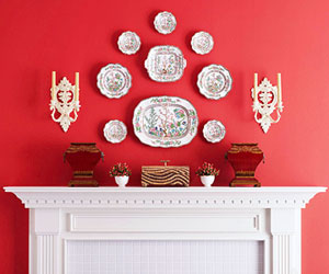
1.  SYMMETRY - a mirror image arrangement of parts or elements.  This is one of my favorite looks because its orderly, calming to look and pretty easy to achieve. After seeing this BGH picture below I now want to add a simple picture or two above my boat on my mantel.  

This picture tweaks symmetry a bit.  It uses 2 like items, the terra cotta pots, but they're not identical.


A traditional look from BGH.


This was one of my own inspirational pictures for our new fireplace that uses some symmetry.  


Here's a mantel I spotted in the Washington Design Center lobby with the same look. 


2.  ASYMMETRICAL - the placement of different objects on either side of a center point where they balance each other, also called informal balance.  This is a hard look to achieve.  The tendency is to put everything in a straight line.  With a little practice you can get the right balance and proportion.


3.  LAYERS - Displaying a grouping of items without being too cluttered.  Another tough look to achieve but if you vary the height of objects and leave some room in between objects it will look interesting without being to hectic.


5.  REPETITION -  rhythm is created where shapes, forms, lines, or colors are repeated.  Another favorite look of mine from BGH.  Use 3 or 4 items to get the look.


6.  MINIMALIST - less is more.  This look can be used for both contemporary and traditional settings.  Makes a bold statement just make sure it matches the look of your decor.

Here's a contemporary look by BGH.


Here's a more traditional look by Michael S. Smith (another favorite designer of mine that I'll be highlighting soon.  I'm waiting for all the publicity to die down over his not so stellar redo of the Oval Room)


Tips for Accessorizing a Mantel

  • Keep it neat and orderly if using lots of objects or collections
  • Start with a focal point and work outward
  • Group smaller objects together for bigger impact
  • Group objects in 3s or 5s
  • Put taller objects in back and vary height of objects
  • Use books to raise items and vary height
  • Vary shapes by mixing round, rectangular, square, irregular
  • Small objects tend to get lost on a mantel