It still has not sunk in that we are renovating our kitchen. I've been planning this moment for a long time and now that it is here, it doesn't seem real. Even after four weeks of our family of four and our new puppy living in our master bedroom and eating frozen and carry out meals (with the exception of once a week getting a wonderful home cooked meal at my in-laws house...thank you Bill and Carol!), it seems like a dream. We renovated our house five years ago which included new windows, new portico, some walls taken down, new bathroom, and exterior stone work, and more. But a new kitchen was not in the budget until now.
We bought our home 14 years ago. Within a month of closing on our house, we covered up the yellow linoleum with grey linoleum (a good tile lookalike), replaced the green perimeter counter top with a light grey laminate to coordinate with the existing darker grey island laminate, and painted the unattractive builder grade cabinets cream and "weathered grey" and upgraded our appliances. You'll see a picture of it later in the post. It was a quick, cheap fix that worked for many years. But we've become tired of fixing broken cabinets, looking at chipped laminate and paint, and our appliances were starting to fail. Plus there was also a desire to upgrade our kitchen's finishes so that it worked with the rest of your home.
So we dusted off the architect's plans from five years ago and started the design process. The design process started the same way I start many client projects…reviewing inspirational pictures. I have collected 1,000s of photos from magazine photo libraries, Pinterest and Houzz and searched them for kitchens and finishes that I really like for our home. I probably saved close to fifty images for this project alone. I like so many different kitchen styles, but when deciding on a kitchen style, I feel it's super important the kitchen design speaks to the architecture of the home and the lifestyle of it's inhabitants. I also wanted our kitchen to be classic and stand the test of time.
Below is an image that I come back to all the time. I love the white inset cabinets, the mix of glass and solid doors, the creamy marble counter, the mix of wood island with white cabinets, the wood floors, and generously scaled pendant lights. I thought for sure our new kitchen would be a close cousin to this one.
Here's another kitchen I've admired for some time. I like the white cabinets, shelving for dishes, herringbone wood floors, and the dark island cabinet finish. We have black accents through out our home, so I liked the idea of having a black island. The mix of counter top materials was interesting, but most of all, I really like the
La Cornue stove and vent. The mix of metals on the oven and vent is sophisticated and beautiful plus it's a go to stove for serious chefs. We've always had a pot rack hanging over our island which we didn't want anymore but I've liked how they displayed the pans on the walls for a working kitchen feel so they are easily accessible.

Well, after admiring these images for many years, we have decided to go into a completely different direction. As much as I like white cabinets, I felt they would be too stark in our home. Plus Abbie, a newfie puppy and recent addition to our family would ensure they would have to be cleaned daily. Abbie looked like this in December…
Here's Abbie at seven months and with a lot more growing to do.
It became obvious wood floors were not practical considering our family's pet choice. Plus we are messy cooks. One of the tougher decisions we made was not to use marble for the counter tops. We are one of those families who usually doesn't change our filters timely, so sealing a countertop was guaranteed not to get done timely either. Also, Abbie is a champion counter surfer, so basically we opted for an almost indestructible quartz counter top.
So our kitchen is going to look most similar to the kitchen below with some adjustments. This particular kitchen won Kitchen of the Year by House Beautiful in 2013. Like this kitchen, we've opted for inset wood cabinets, natural tile floor, Ceaserstone counter top, and creamy white walls. There are several differences too, such as we are not doing a hanging pot rack, and our countertop will be much lighter. I want our kitchen to be cozy but also reflect lots of natural light.
I really like the painted interiors of the glass cabinets below. The plan is to paint the interior of our glass cabinets a light color too.
When you consider the picture below of the front of our house, I think you can see another good reason why we went a very different direction with the kitchen design. The warmer, more rustic feel of the kitchen fits the style of the home.

As much as I love soapstone countertops or honed black granite countertops, our flooring choice lead us in a very different direction. Once I saw this natural slate tile, I couldn't consider anything else for our kitchen and dinette floor. The grey/blue and orangey brown colors worked great in our home and it brings an outside feel to the inside of the home. The manufacturer says the stone has significant "color variation". I've also chosen to install the floor tiles in a random pattern for even more variation…a bit scary, but I feel this floor is going to have some definite personality, in a good way! But because the floor is going to be lively, it's the reason I've kept everything else in the kitchen very simple…one finish for the cabinets, a creamy light countertop and creamy tile backsplash.
I have a lot more to share on finishes, lighting, layout, appliances, etc but it'll have to wait for another post.
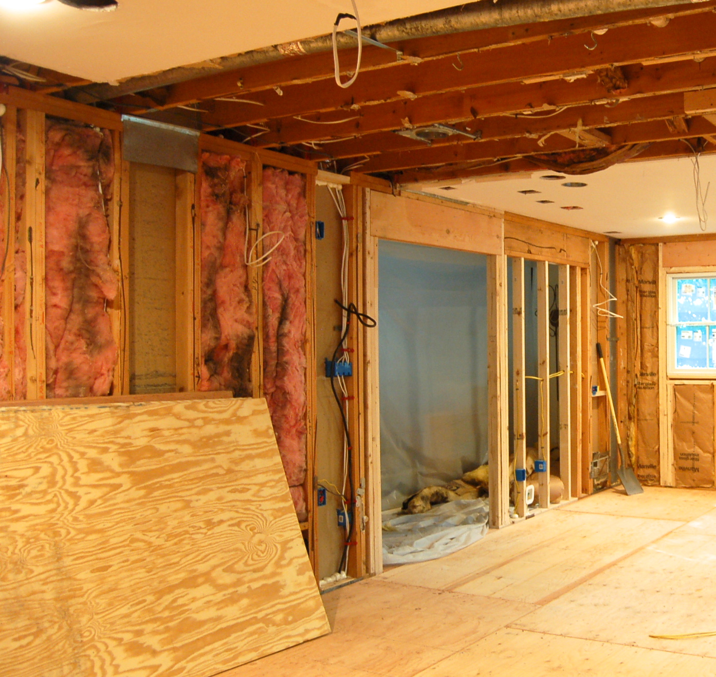
Dry wall started getting installed this week and cabinets get installed next week so it'll be moving quickly over the next few weeks. But in the meantime, I'll share a few before pictures and progress pictures.
Here's what our kitchen looked like right before demolition.
Once they took the wall down behind the stove, I knew immediately, we had made the right decision. Our kitchen had very little natural light. Below you can now see the natural light pouring into the space.
The picture below may not look like much but it is amazing the amount of work it took to get it to this point. Five new windows were installed to bring in as much natural light as possible. Our stove and vent will be centered between the windows on the far wall. The new opening on the left leads to our dining room. All new electric was put in. The plumbing was significantly reconfigured so we wouldn't need bulkheads anymore. The HVAC was reconfigured, so much so, we decided to move to a two zone system, which was not part of the budget.

Below you can see three windows were installed. These windows are centered on the existing bay window on the front of your house and the opening from the dining room to the kitchen. The idea is that you would be able to see our back yard from the from the front of the house. An architectural feature that I'm a big fan of. Our sink will be centered on these windows. We also pushed the windows out an extra 8" to give the kitchen a more expanded feel in that area. My architect, Jeff Gallaher, suggested we do this, and he was completely right.
When you enter our house from the front door, you walk down a hall and see this room ahead. It's always bothered me that the opening was not centered on the light fixture or the back sliding glass door.
Here you can see we've fixed this by opening up more walls and we replaced four sliding glass doors with new windows in our family room. It took a heck of a beam to accomplish. The white slab door on the left leads to your back yard and is temporary until it's replaced with the door below, which will be stained the same color as our front door.
Here's our new back door to be installed soon.
Manor Construction is our builder and they are doing a fantastic job. They do quality work and are keeping the project on schedule.
Around The Clock Plumbing,
Brighticity, and
Bay Area Mechanical did a ton to make the plumbing, electrical and HVAC work with the new layout. These companies are professional and quick. Permit inspections were a breeze.
I hope you enjoyed the information I shared and find it helpful in case you're planning your own kitchen renovation soon!
Have a great day!
Melissa


